I'm Joyce, a digital designer with 6 years of experience in user-centered, data-driven, and business-oriented design. Engaged in a diverse array of projects spanning the entire design cycle, from initial exploration to delivery, across various scales.
Shaped by strong roots in architecture, my design journey informs an approach that seamlessly blends form and function, ensuring robust solutions. Thriving in collaborative, ambitious, and coffee-fueled teams, I champion human experiences through the power of research and creativity.
Recently relocated to London, I am actively seeking new design challenges after serving as a Project Lead & UX/UI Designer at blueegg, a Sydney-based UX design agency.
I look forward to contributing to impactful projects and collaborating with diverse teams.
Revolutionising Woolworths' Talent Attraction: Redefined Career Site & Application Experience
Woolworths, a major Australian multinational in retail and finance, employs over 200,000 people across 13 brands. In the competitive job market, the demand for skilled talent is intense, yet the existing applicant experience falls short of industry standards.
We enhanced conversions and application completions by crafting a narrative driven experience reflecting Woolworths' new team value proposition, prioritising engagement, inclusivity, accessibility, and mobile optimisation.
#endtoend #UX/UI #re-design #careerswebsite
Transforming the CMC Markets website for simplified user journeys, we aimed to create a focused and consistent unified hub for all traders.
CMC Markets is a global digital trading and investing platform with an annual revenue exceeding $600 million. However, their current Australian website presented challenges: complex navigation, overwhelming information, and a lack of differentiation between brands and product offerings.
In the realm of trading, clarity is the compass. We embarked on a journey to revamp the website, enhancing the Information Architecture (IA) and User Experience (UX), creating seamless experiences for both new and experienced traders.
#websiteaudit #Informationarchitecture #UX/UI #re-design #financewebsite
Streamlining the growth of Australiaโs digital economy involves redesigning a smart and intuitive user experience for technology professionals to submit their skills migration applications.
The Australian Computer Society (ACS) links global talent to the digital economy, assessing professionals for the sector's future. Despite receiving 30,000 annual applications, 75% lack readiness, causing delays and stress.
Guiding this transformative journey as Project Lead in partnership with the Australian Computer Society and Cloudwerx, I designed an experience that maximised application quality and processing efficiency.
#endtoend #webdesign #UX/UI #strategy #applicationexperience
Designing a on the road food and drink directory for tourist to unravel the hidden marvels in regional Victoria
Within 106 ('within ten six') - a non-profit directory, powered by Tallarook Hotel's owner Tim - aims to make all local produce businesses accessible to tourists. This unsponsored platform functions as a reliable tool for discovering regional Victoria.
We identified gaps in existing resources and designed "Within 106" to fill these voids, offering unbiased insights for on-the-road discovery.
#end-to-end #UI/UX #directory
Seamless Onboarding Portal: Elevating Employee Experiences
Addressing the challenge of a disjointed and inconsistent onboarding experience at Woolies, we've created a streamlined portal integrated into Teamspace, Woolworths' employee-facing platform.
This solution streamlines support for line managers and onboarding partners. The portal enables efficient task tracking, promoting collaboration and eliminating fragmented onboarding issues to ensure a cohesive and efficient experience for new employees.
#UI/UX #contentstratergy #onboardingportal
Woolworths, a major Australian multinational in retail and finance, employs over 200,000 people across 13 brands. In the competitive job market, the demand for skilled talent is intense, yet the existing applicant experience falls short of industry standards.
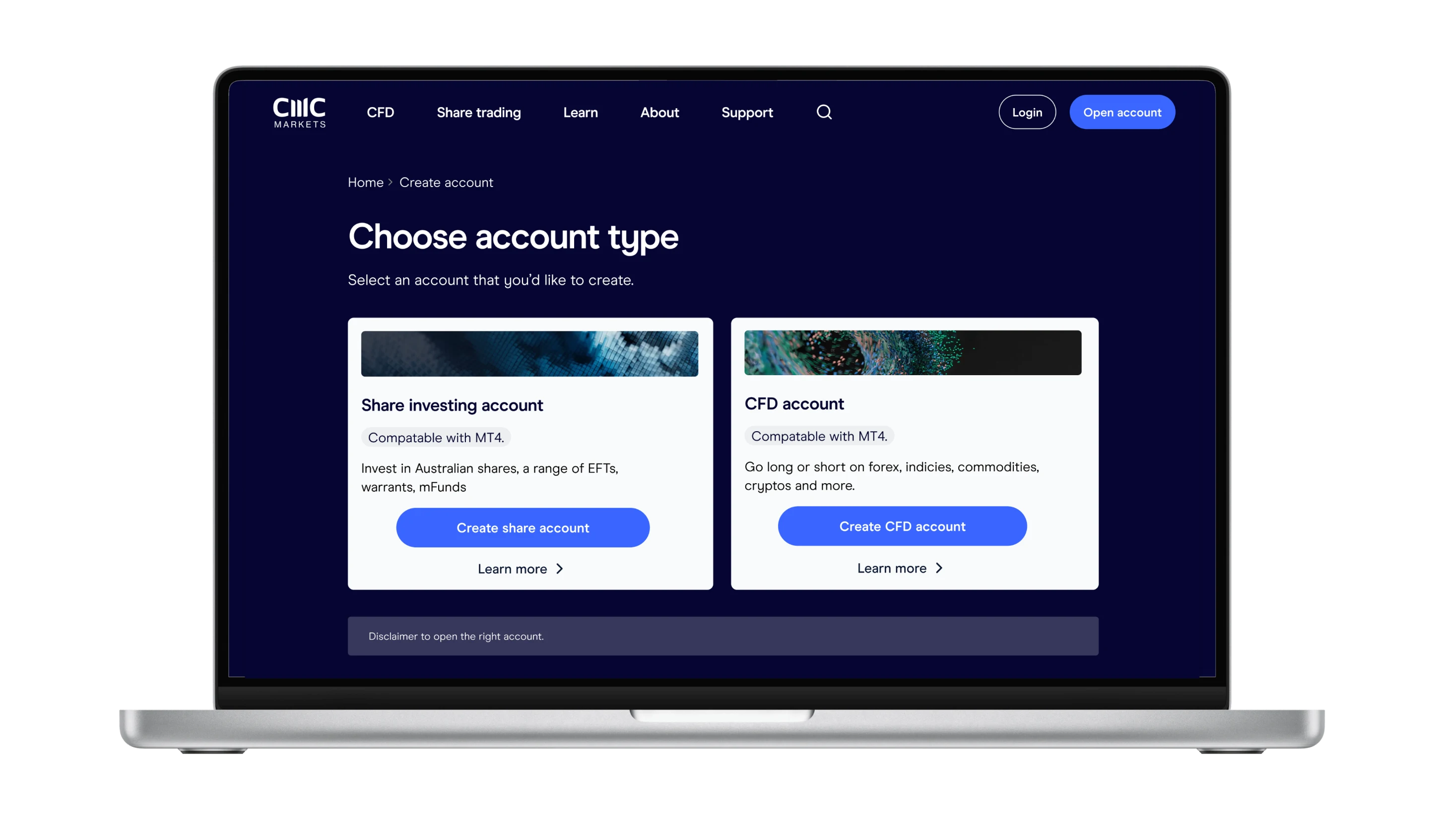
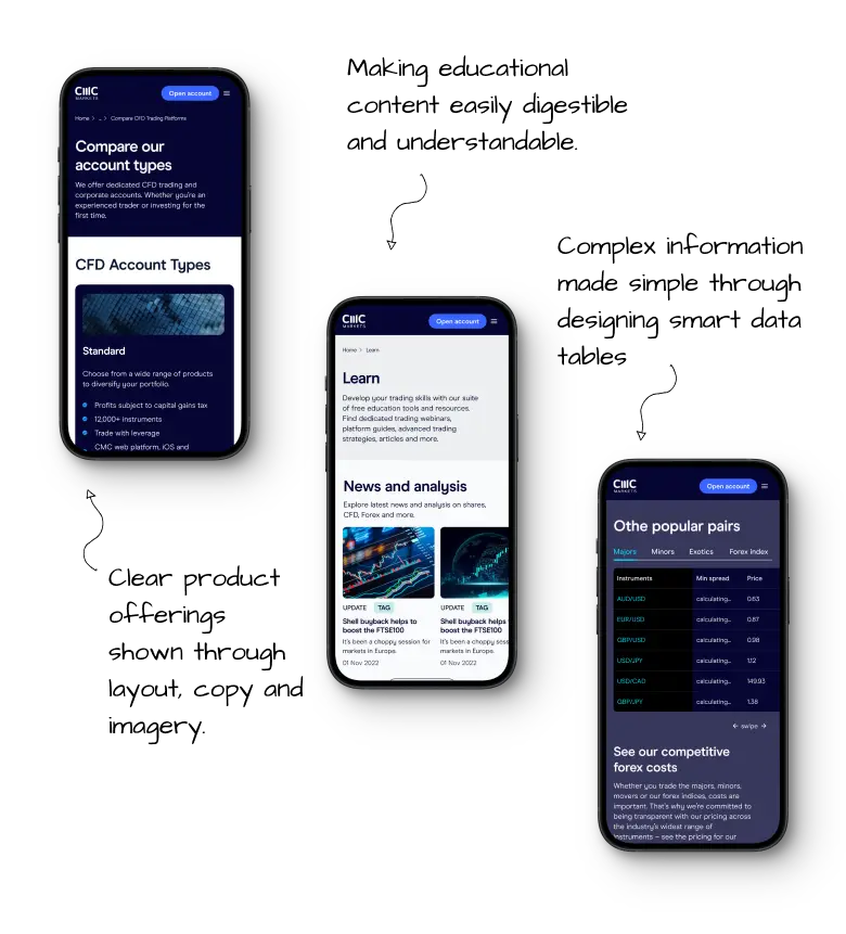
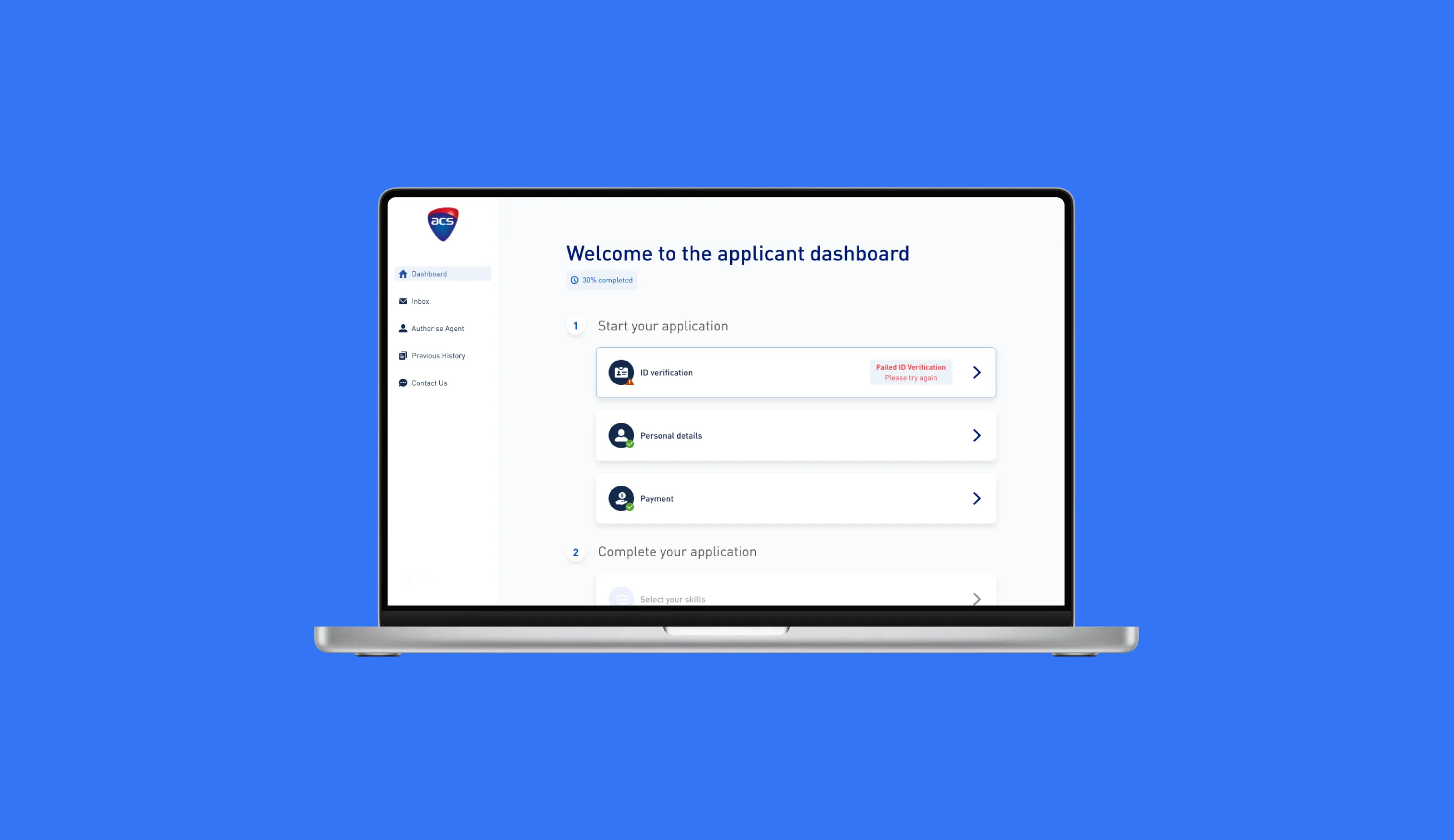
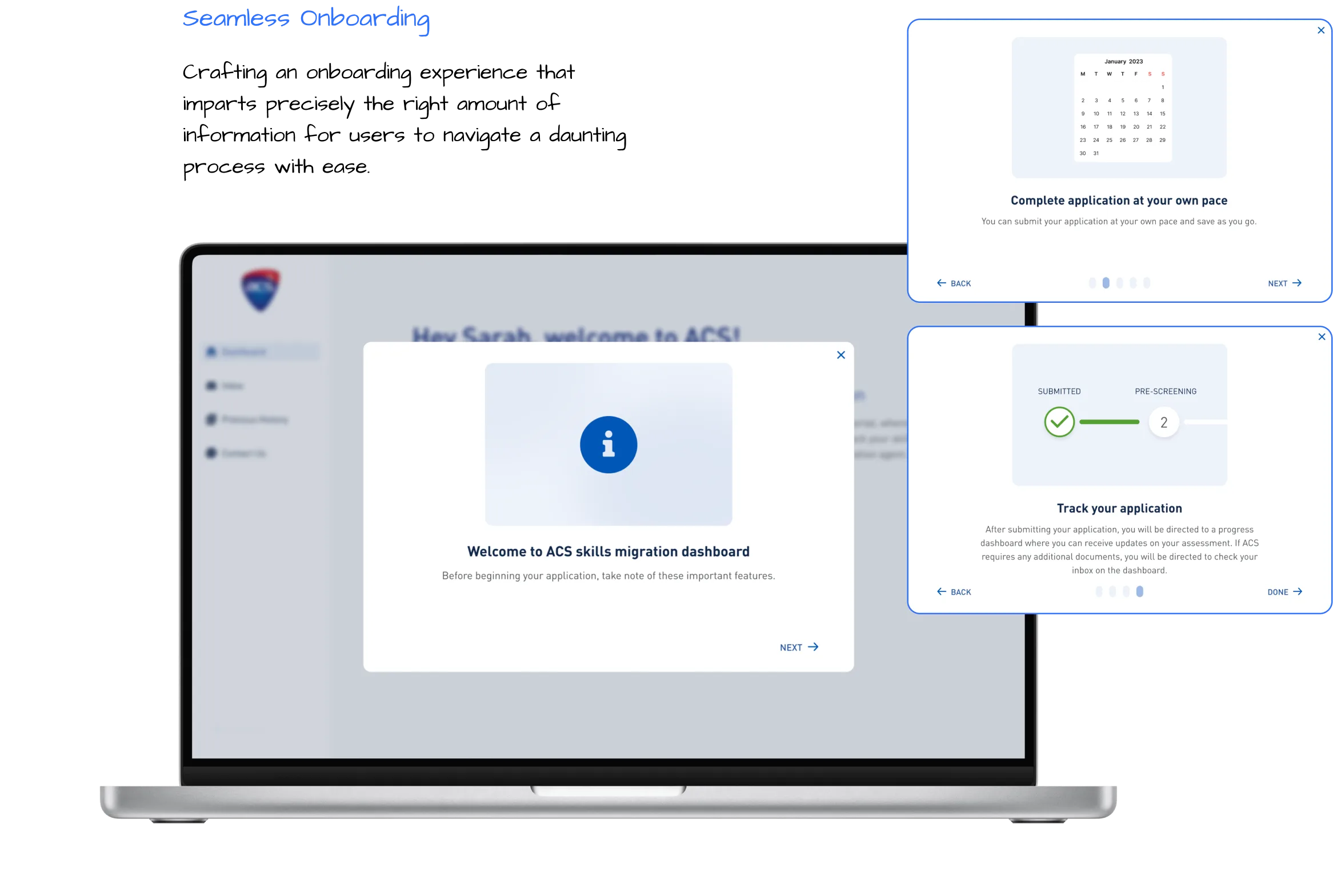
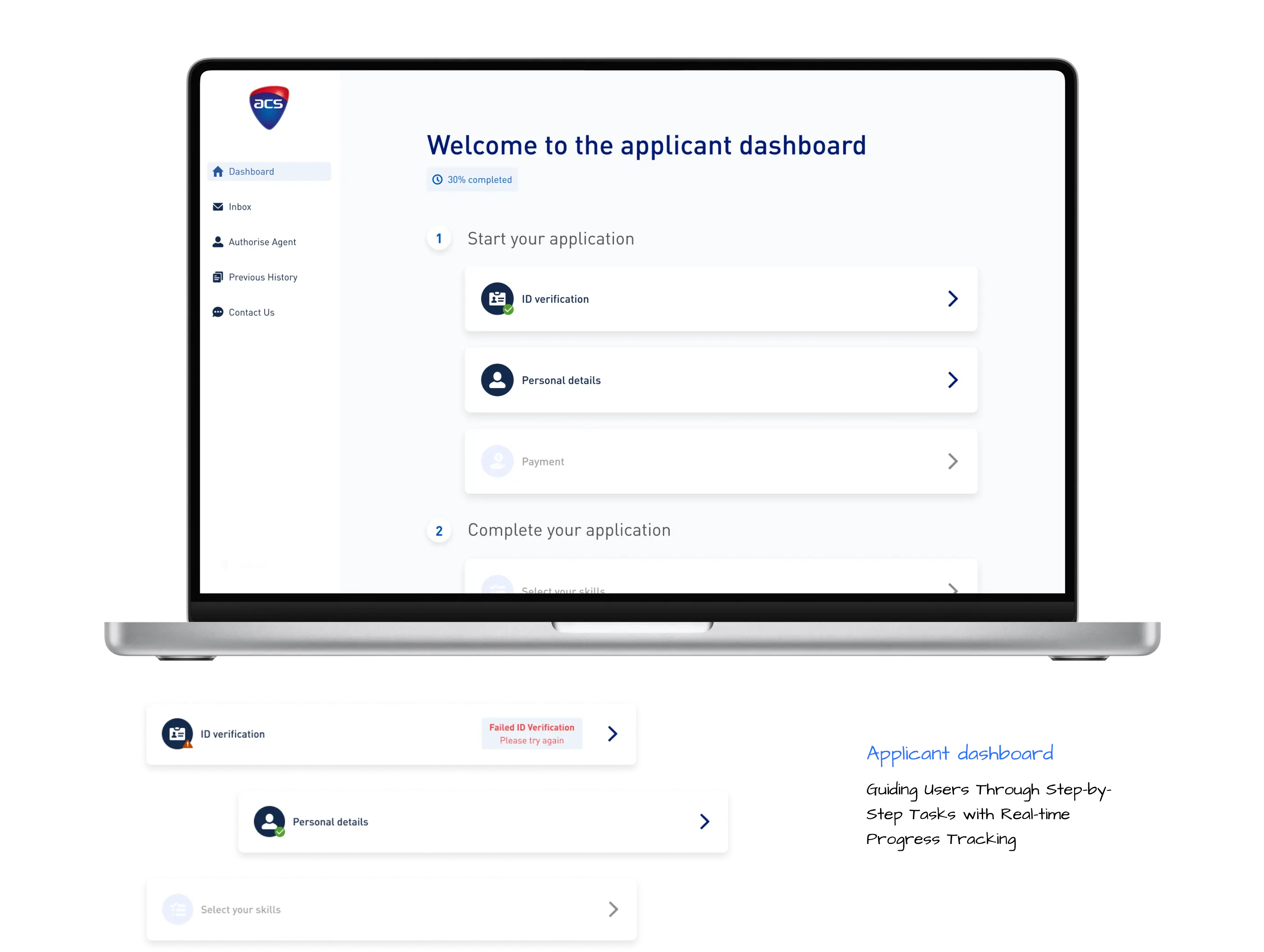
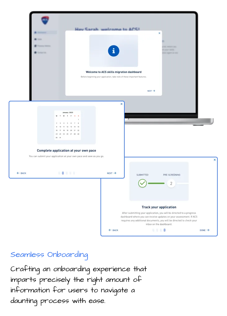
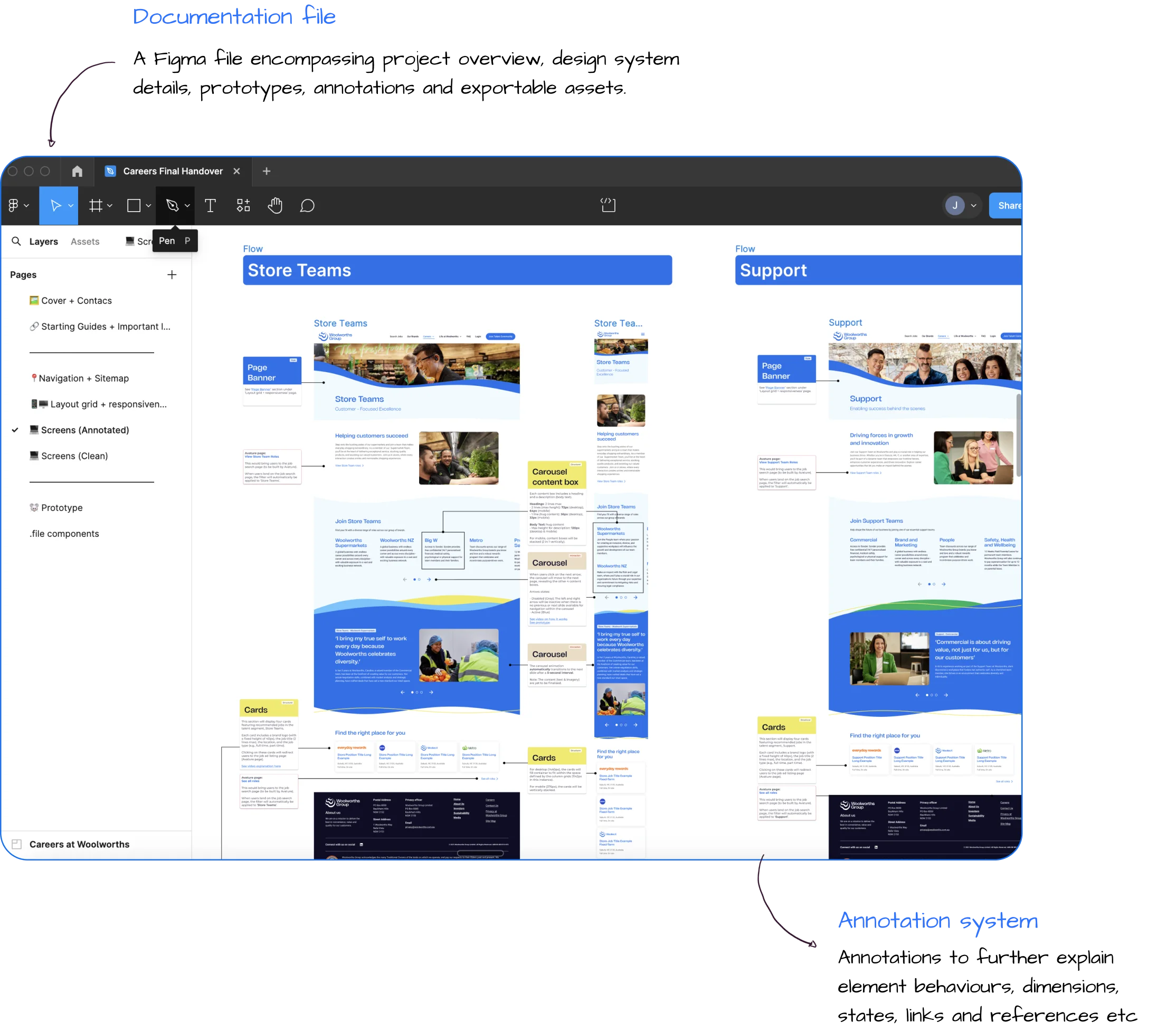
Woolworths seeks a seamless application process by integrating a new Team Value Proposition (TVP), Woolworths group branding, and has acquired a new applicant tracking system (Avature). We enhanced conversions and application completions by crafting a narrative-driven experience reflecting Woolworths' new team value proposition, prioritising engagement, inclusivity, accessibility, and mobile optimisation.
UX/UI Designer responsible for managing initial concept development and design progression, competitive and comparative analysis, workshop facilitation, wireframe designs, usability testing, and conducting multiple share backs sessions.
Desktop & Mobile
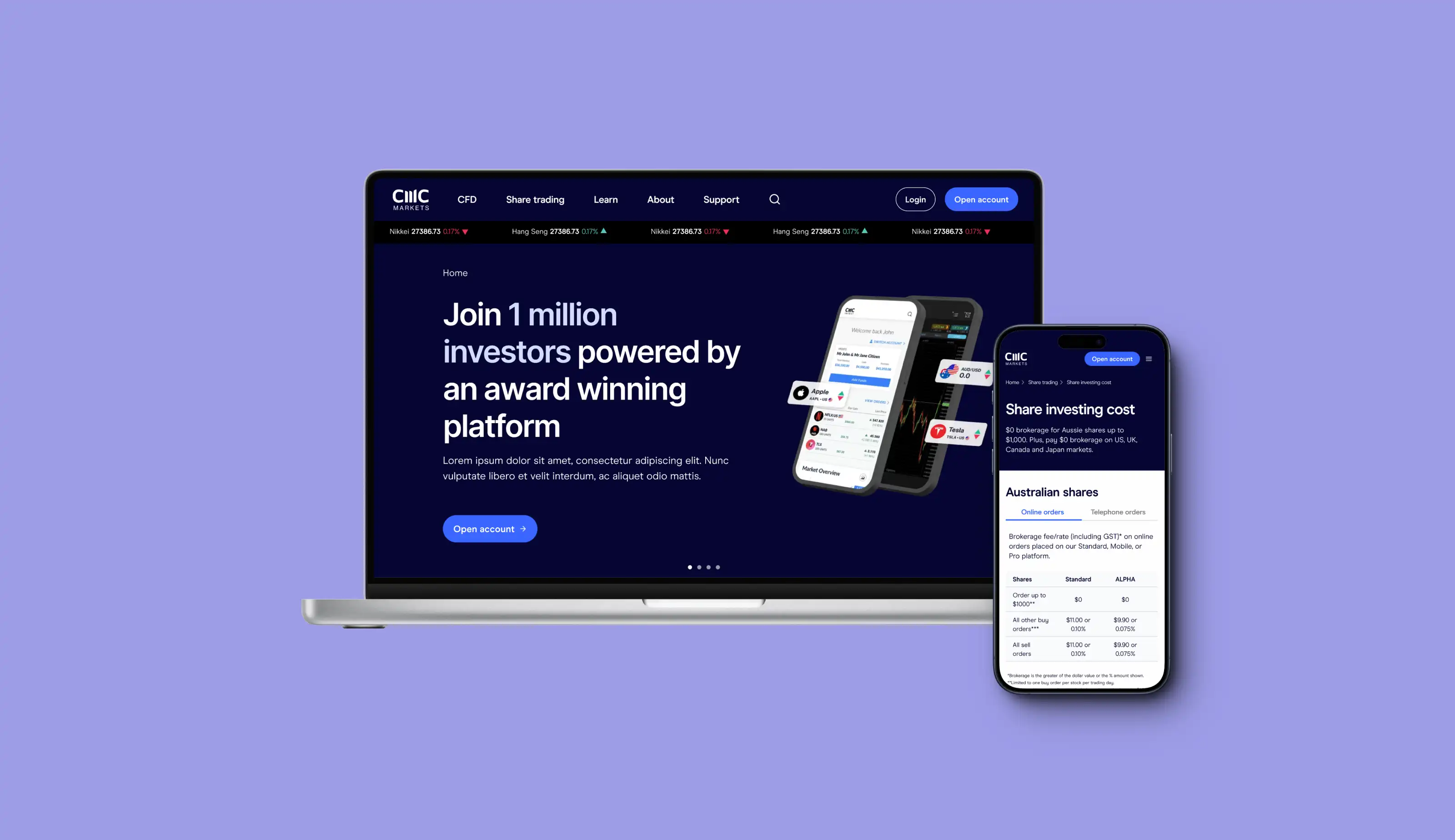
Career Site Re-design
2023
The existing Woolworths career experience faces several issues:
Our journey to transformation involved several key stages:
Our team established the precedent, navigating challenges from translating abstract values to setting consistency standards. We shaped a distinctive narrative-driven strategy for Woolworths' future designs in a competitive market.
Our challenges included an incomplete design system, technological constraints, and managing layered feedback from stakeholders at Woolworths and external consultants. The influx of ideas from various business parties highlights the need for effective and strategic internal stakeholder management.
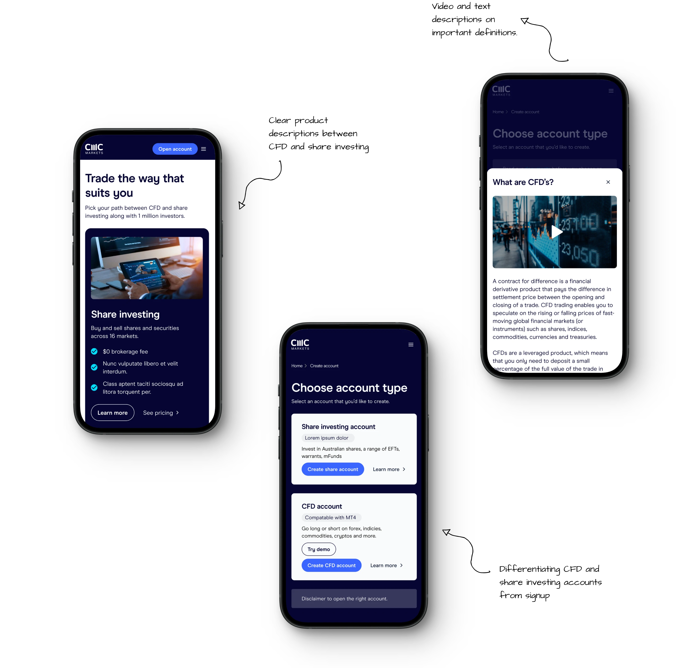
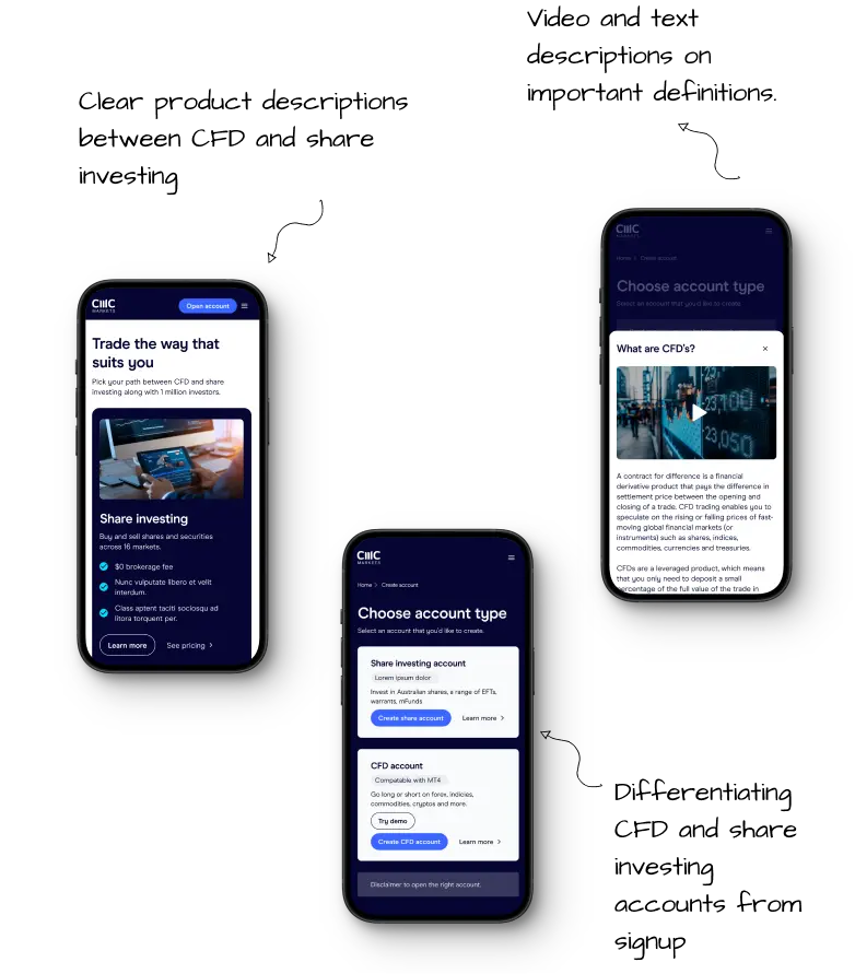
Our design ethos for Woolworths prioritised inclusivity on all diverse communities. The testing phase demanded meticulous coordination through askable to ensure diverse representation, highlighting the significance of teamwork in crafting an authentically inclusive design.
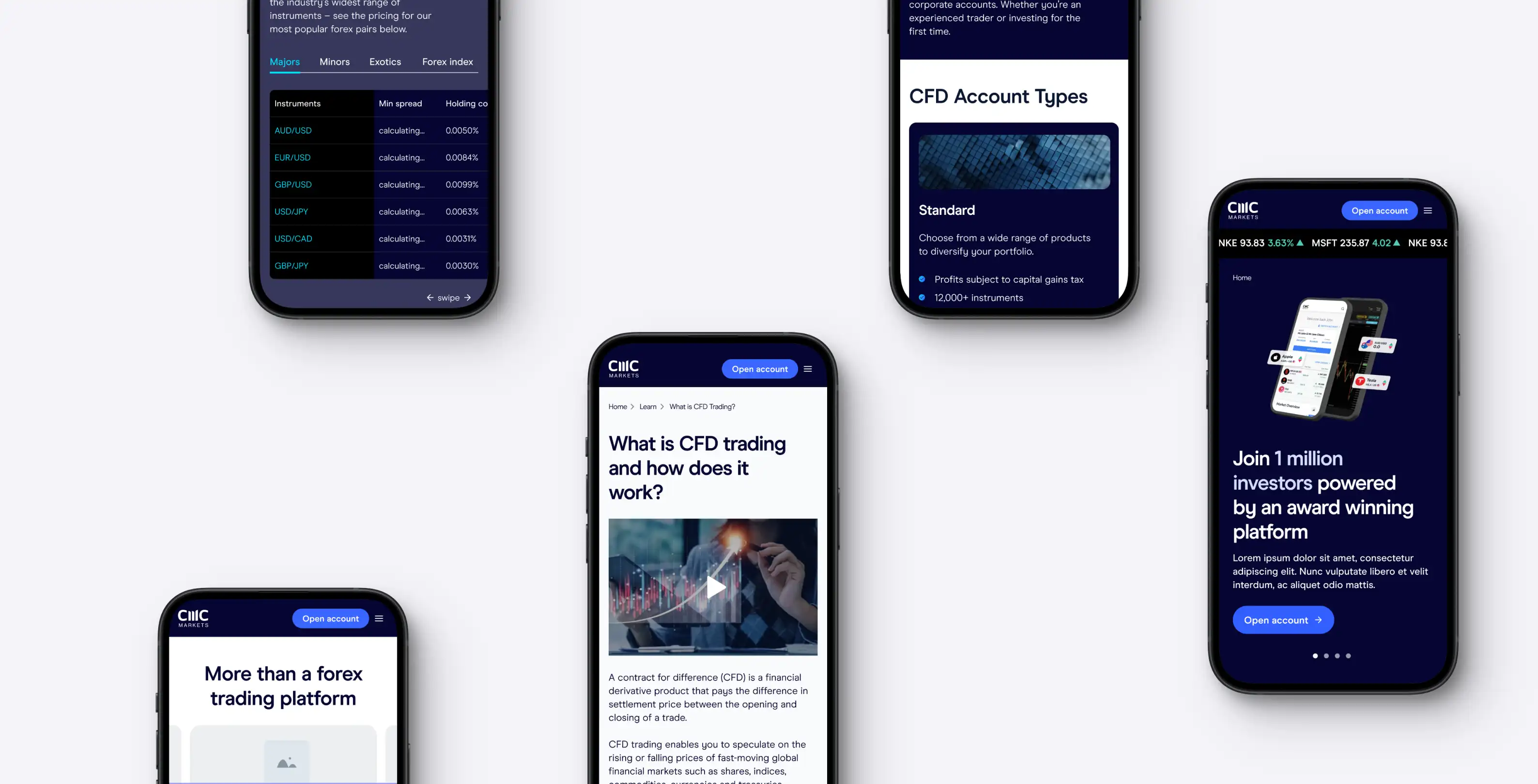
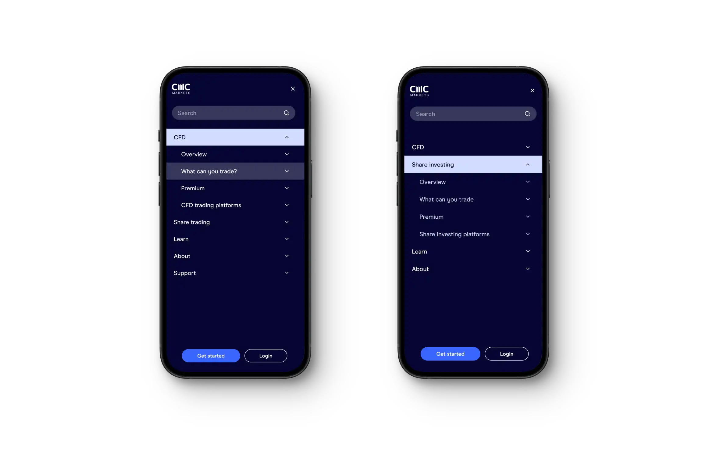
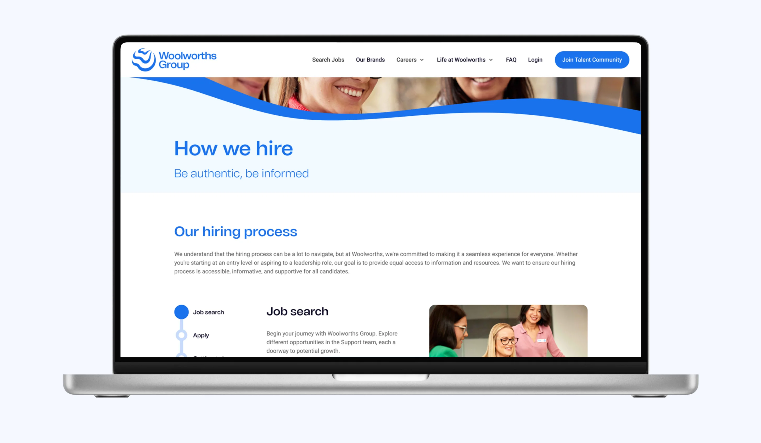
The redesigned career site seamlessly integrates with Woolworths' ecosystem, ensuring a unified user experience that enhances engagement.
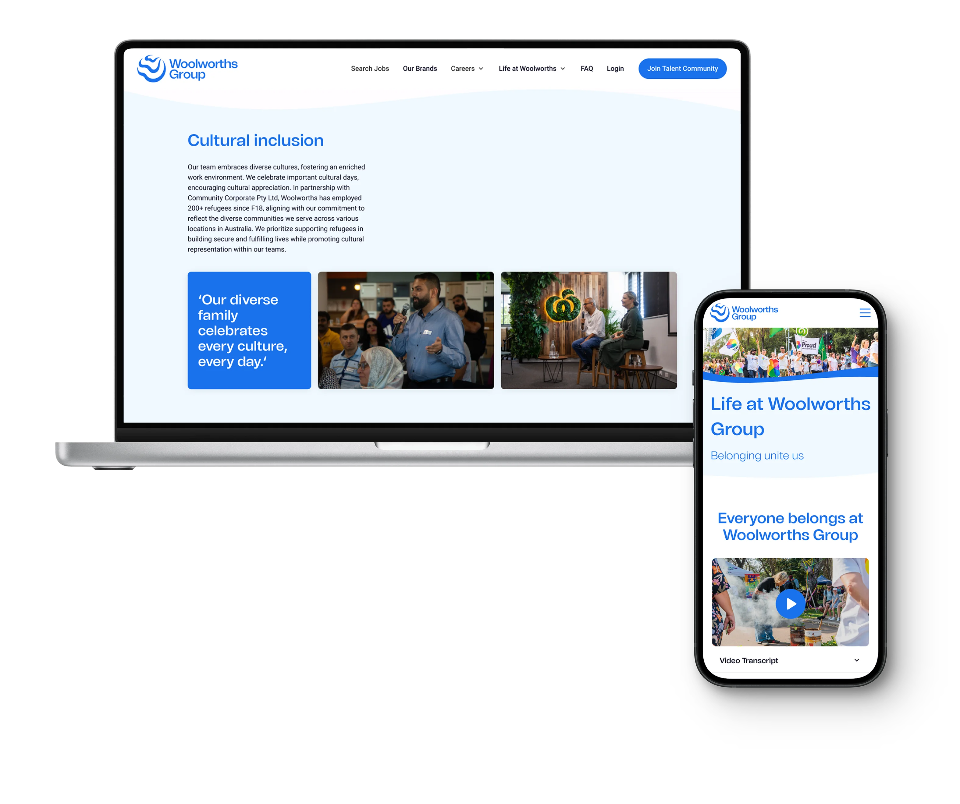
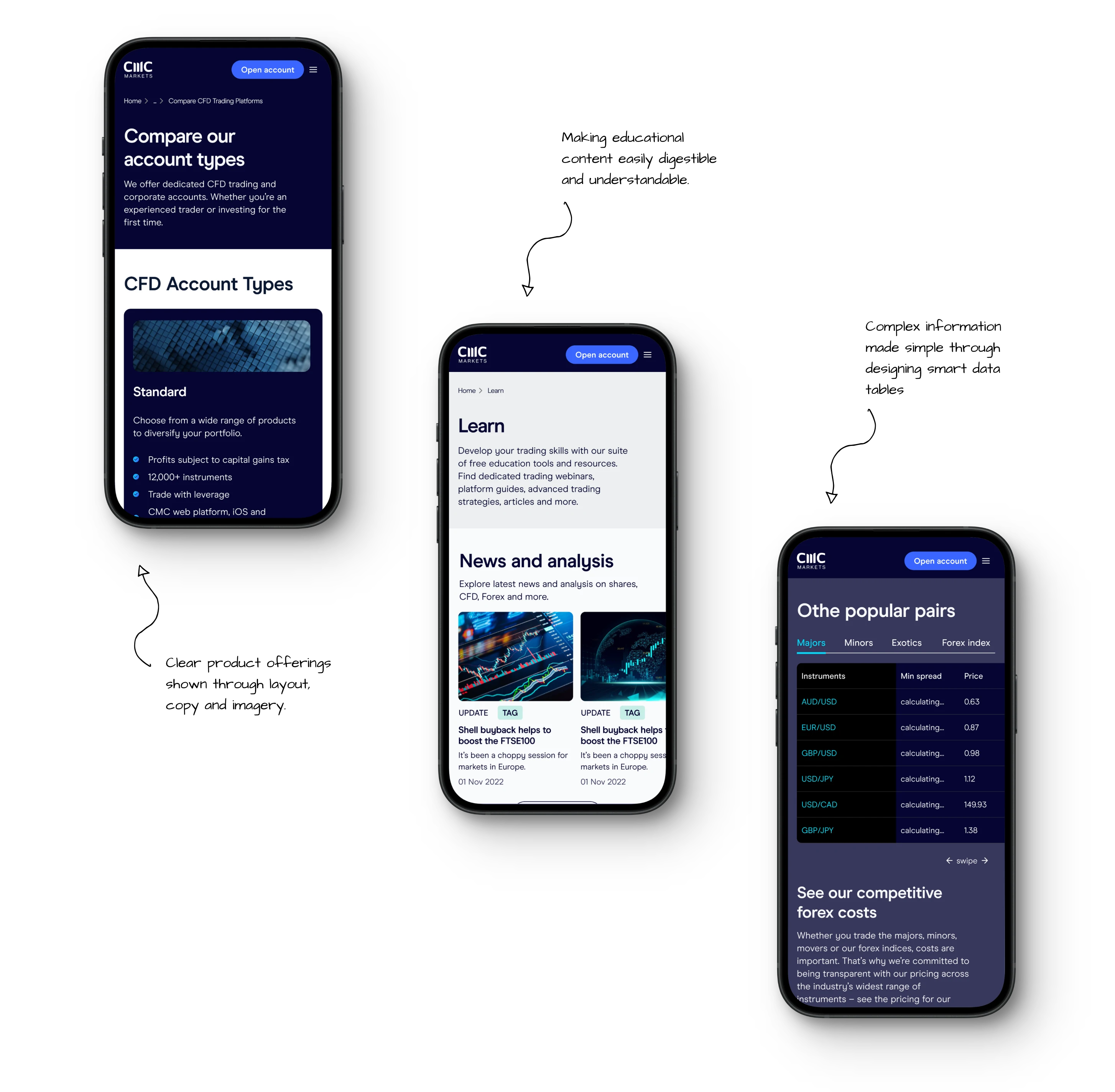
Our designs embody Woolworths Group's strong commitment to diversity and inclusion, fostering a sense of belonging through carefully curated content and layouts.
This includes brief requirements, existing research, Woolworths branding, and the new Team Value Proposition (TVP), complex business teams, while navigating the adoption and design of Avature, a new application tracking system.
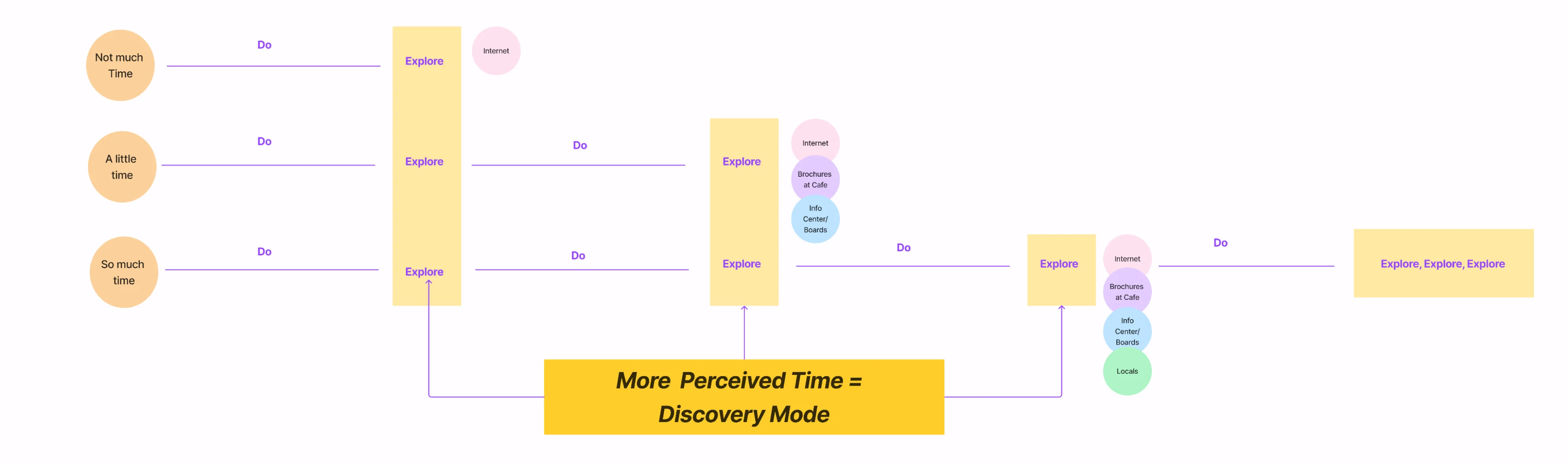
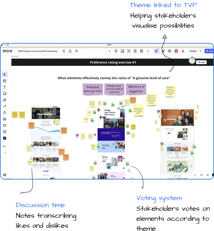
Structured to elicit stakeholder votes on features through the lens of their own Team Value Proposition (TVP), it not only prompted them to visualise the TVP, a step they hadn't taken before, but also positioned us for design success.
What elements effectively convey the value of 'A genuine level of care'
What elements effectively convey the value of 'Endless possibilities'
What elements effectively convey the value of 'Leading the way'
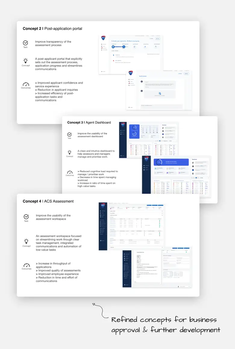
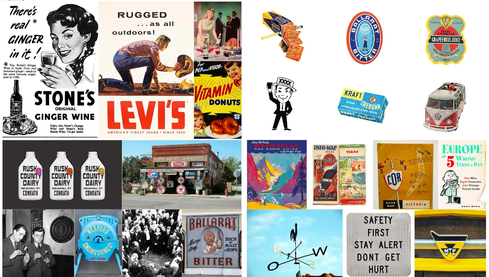
Synthesising findings from the look and feel workshop, we steered the concept design of the career site towards three primary themes:
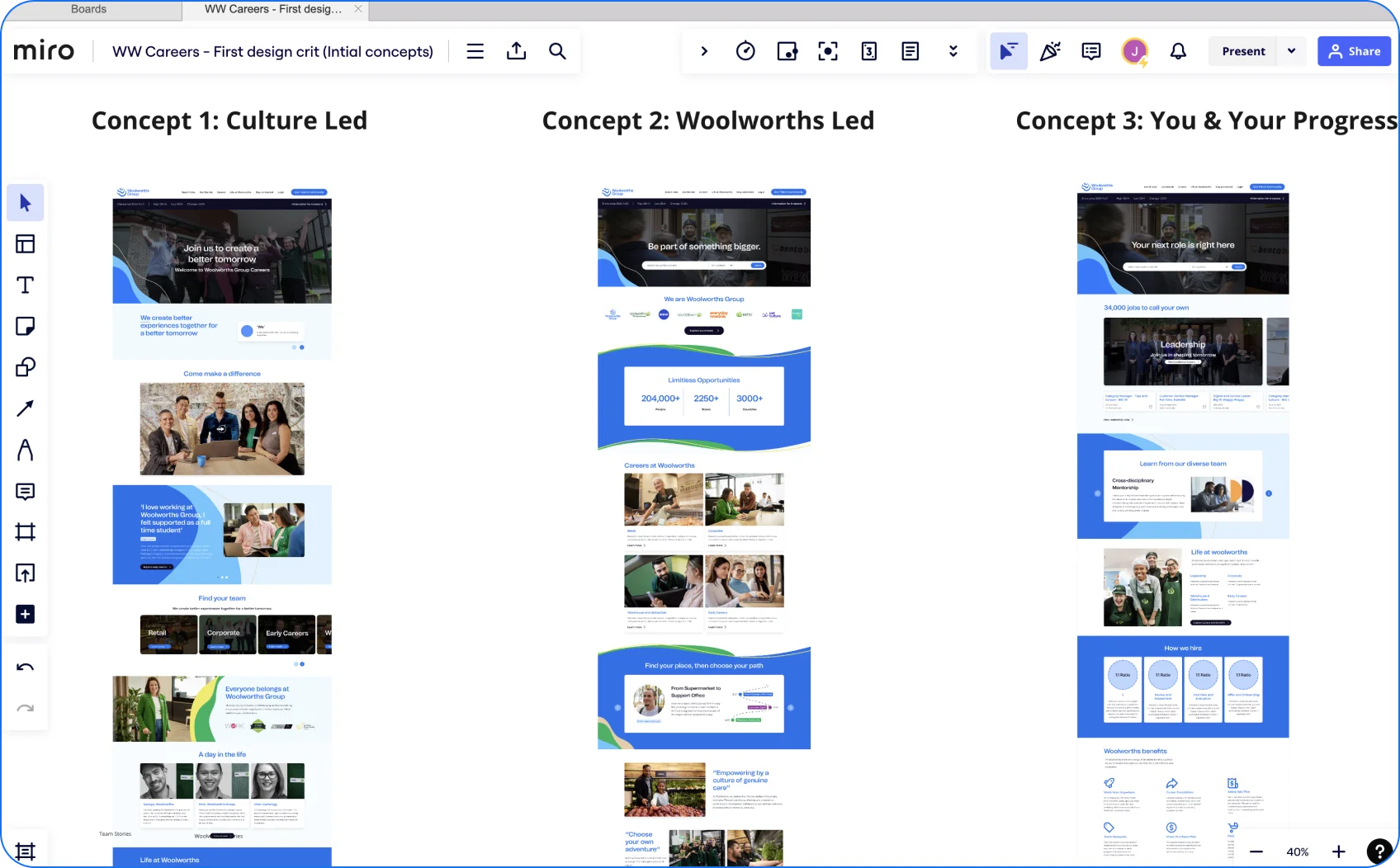
Through a series of share-back and feedback rounds, we unraveled stakeholder thoughts and perspectives. The final designs were ultimately a blend of each theme.
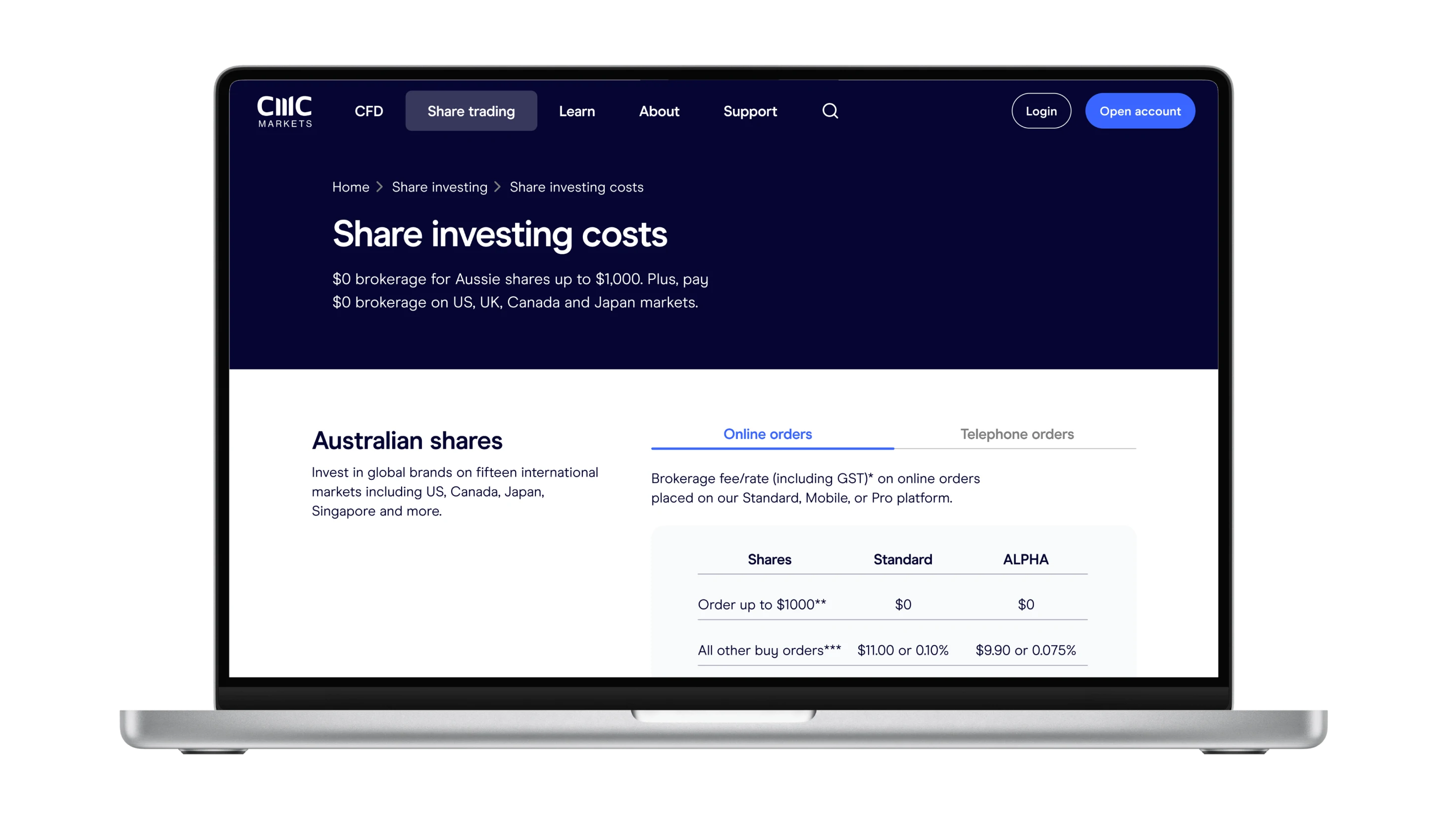
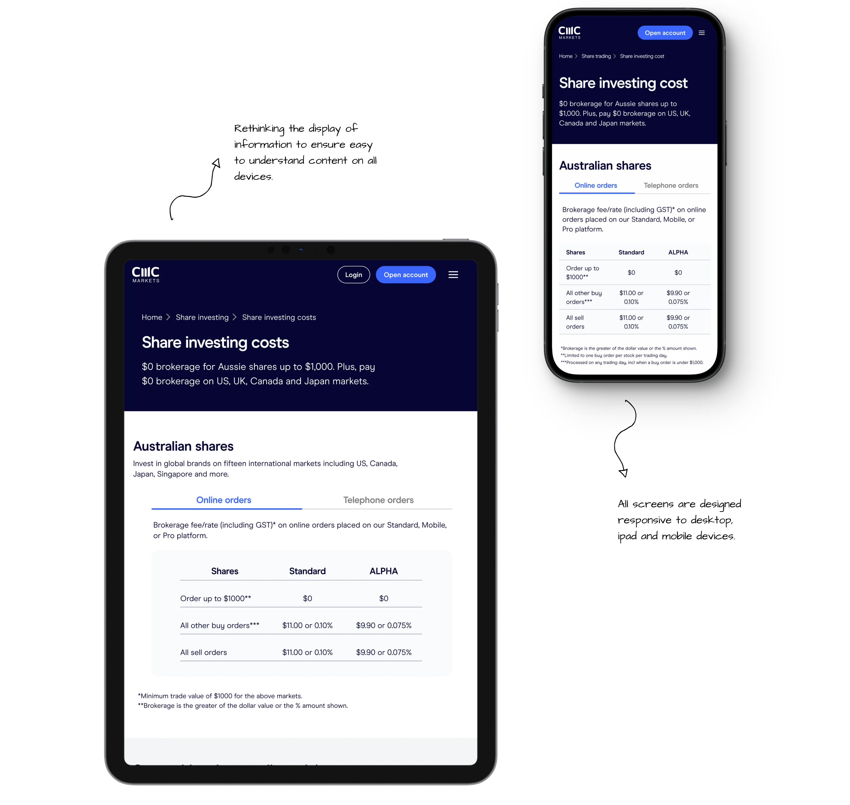
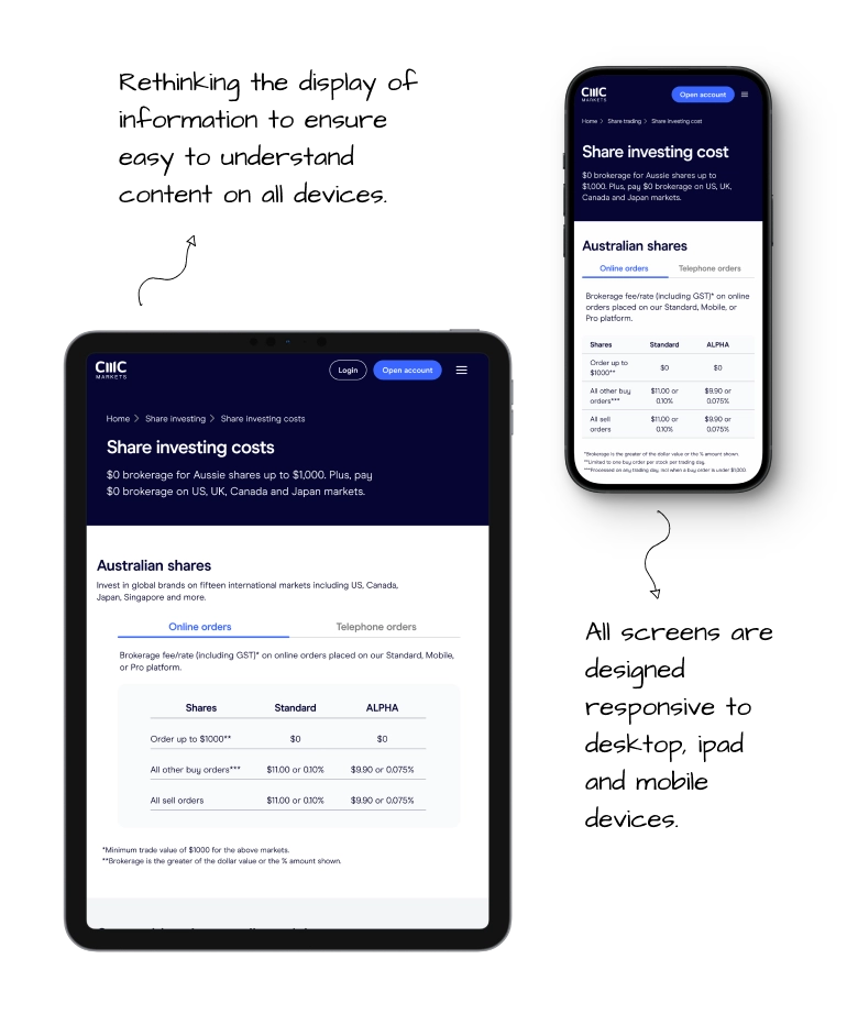
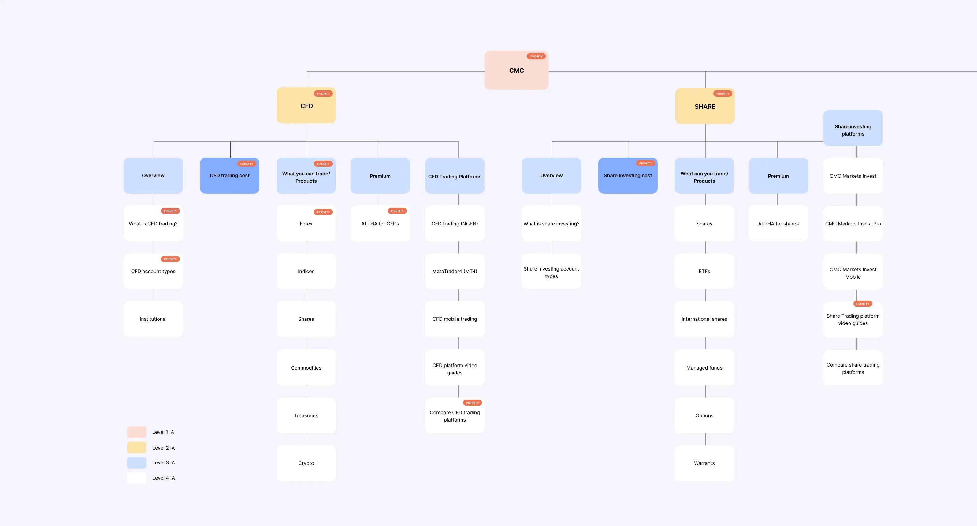
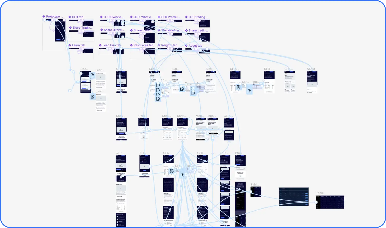
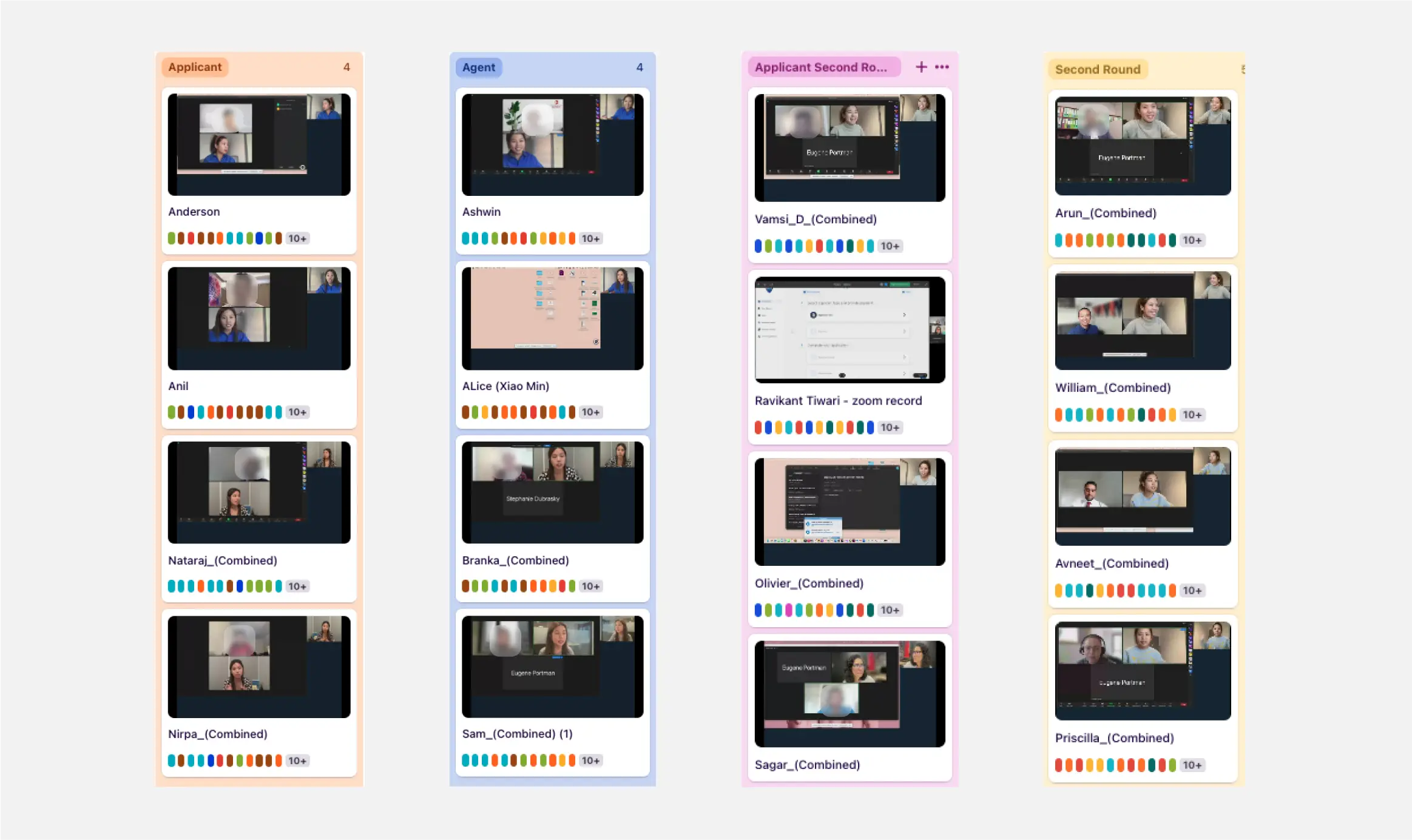
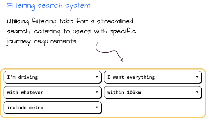
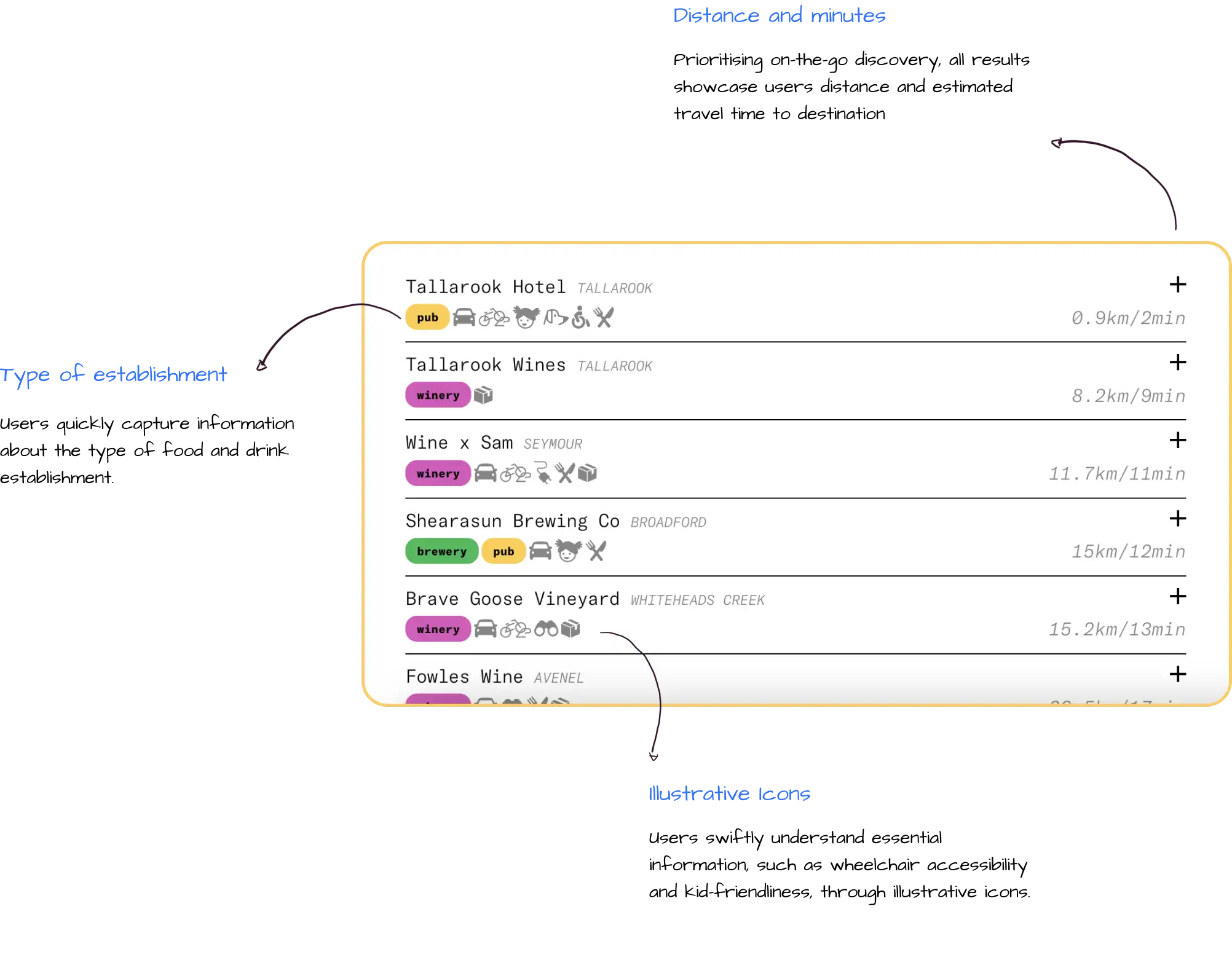
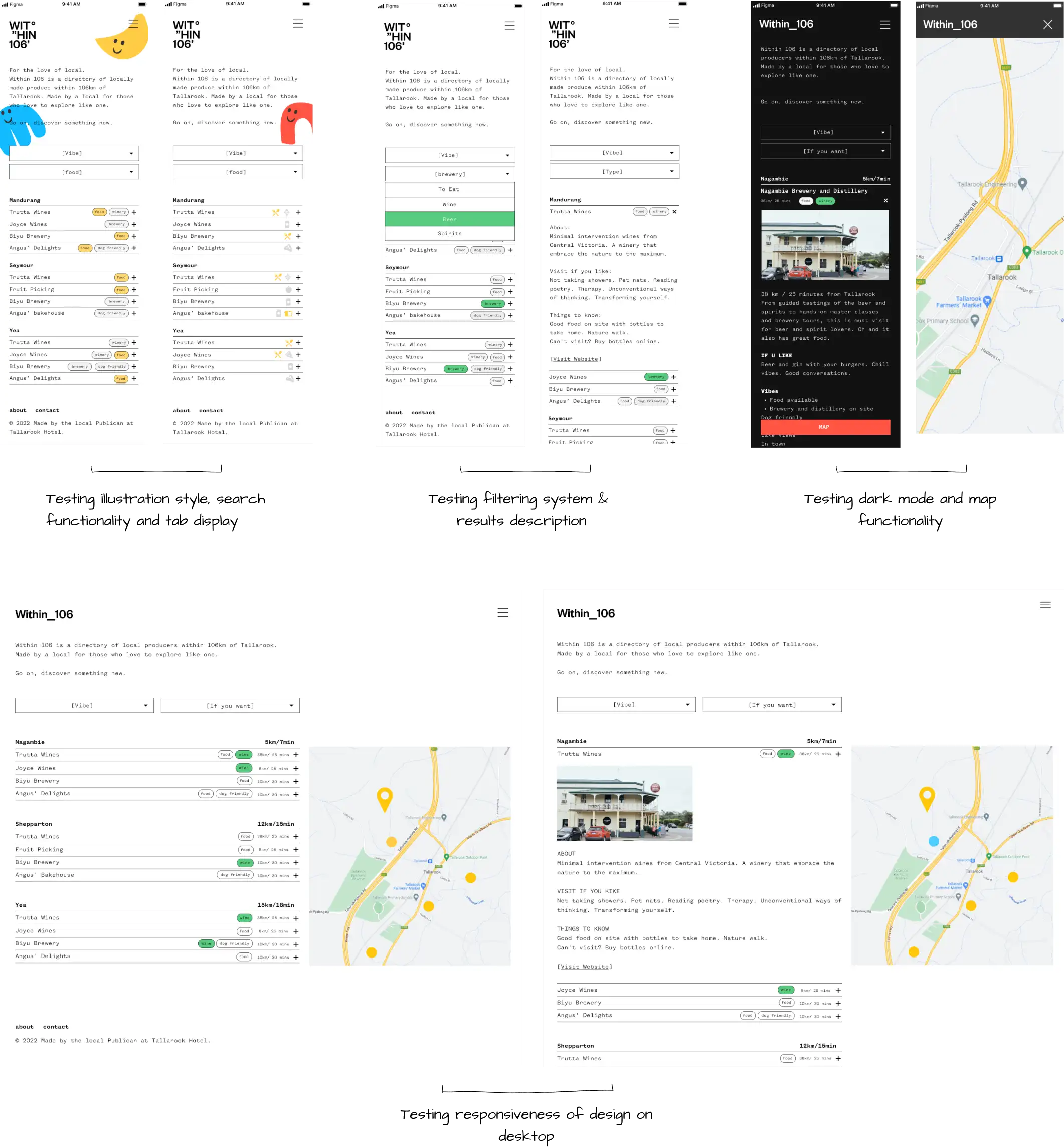
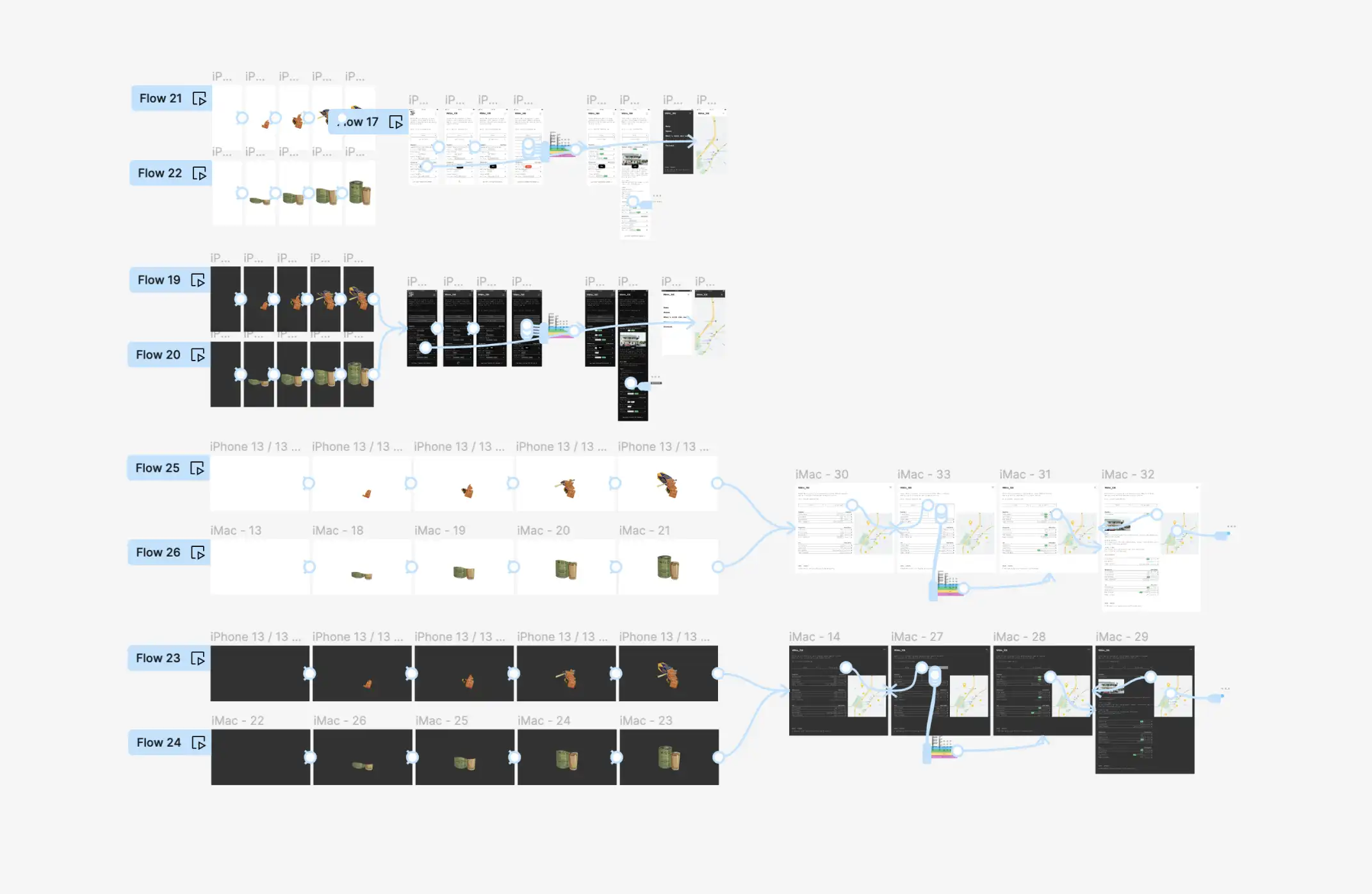
For our usability testing phase, we meticulously crafted mid to high-fidelity versions of 20 pivotal pages on the careers site. This process was complemented by a robust recruitment strategy, ensuring a varied participant pool.
Our research goals were tailored to assess task accuracy and efficiency, validate information architecture, understand sentiments towards language and content, evaluate mobile responsiveness, and ensure accessibility and inclusivity.
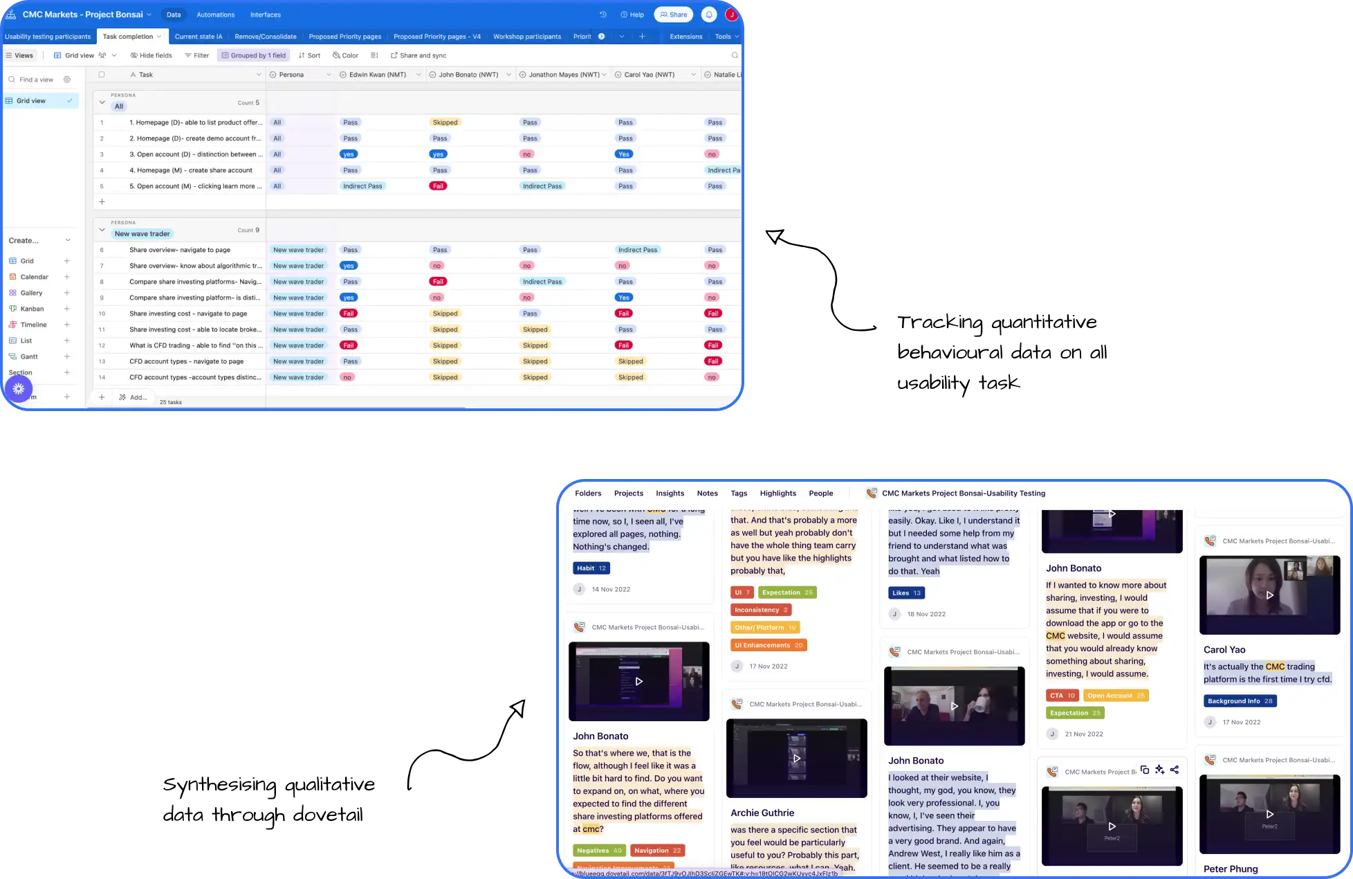
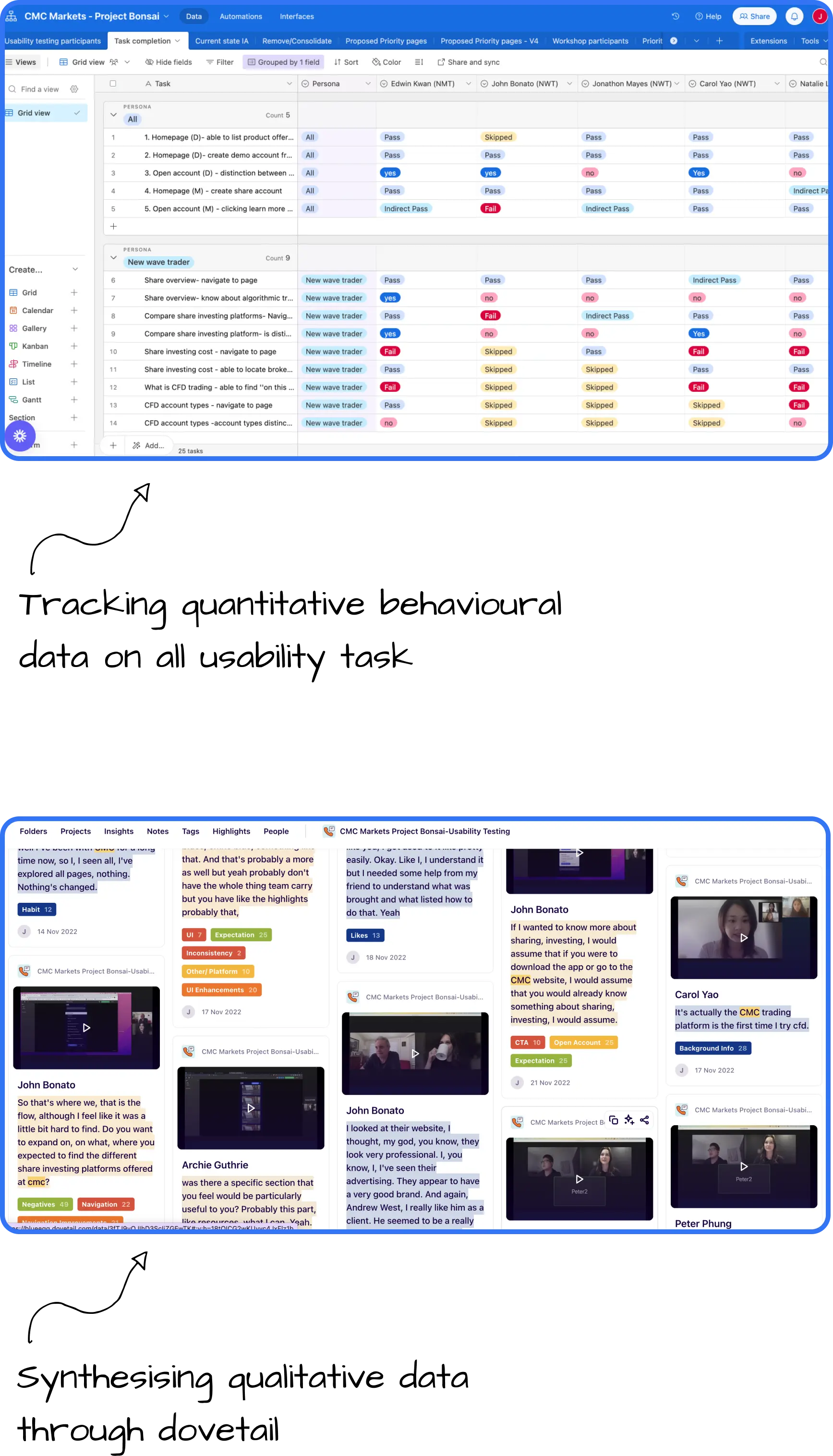
Some snippets from the usability test:
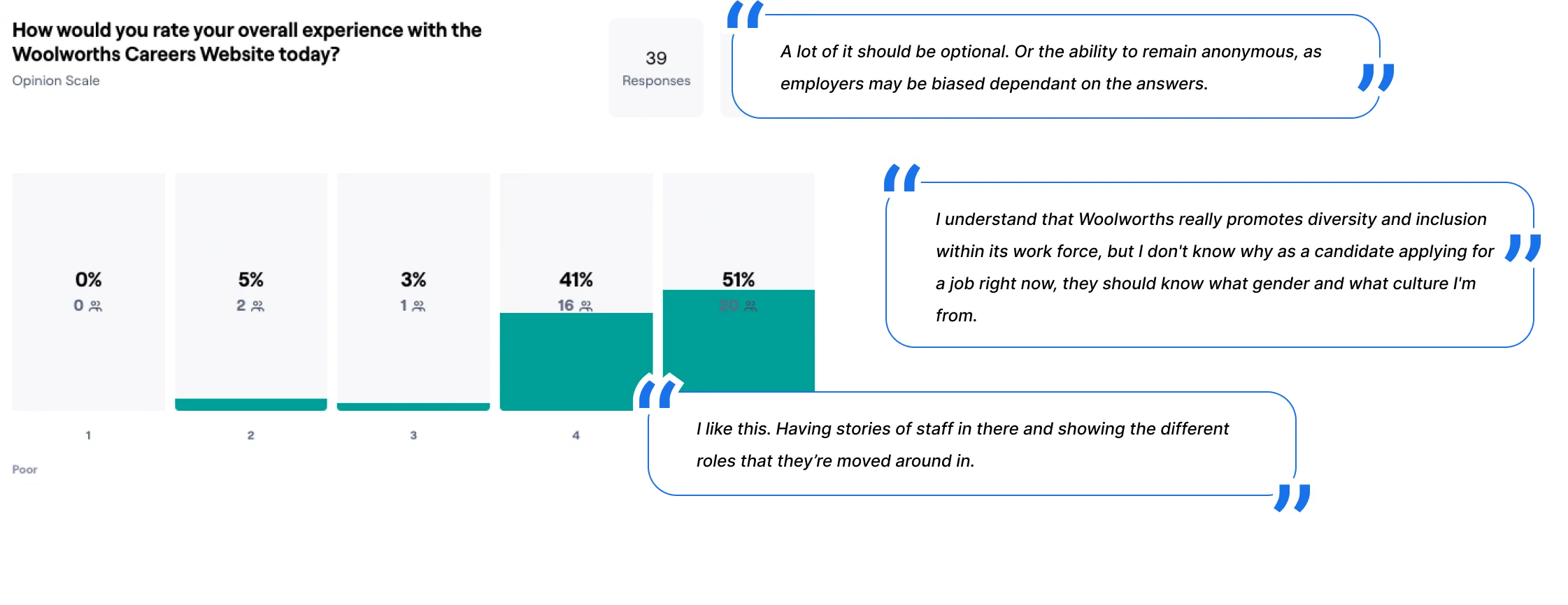
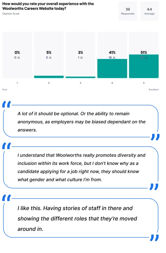
Key Insights and Recommendations:
We eagerly anticipate the site launch, anticipating key metric tracking, including conversion rates and application completion rates.
CMC Markets is a global digital trading and investing platform with an annual revenue exceeding $600 million. However, their current Australian website presents challenges: complex navigation, overwhelming information, and a lack of differentiation between brands and product offerings. While it effectively served existing clients, its potential to educate and engage diverse traders remained untapped.
In the realm of trading, clarity is the compass. We embarked on a journey to revamp the website, proposing an information architecture based on Google Analytics, conducting competitive analysis, and usability testing. The work delivered high-fidelity designs focusing on content hierarchy, consistency, and branding alignment, creating seamless experiences for new and existing users.
As core member of the 4 person project team my responsibilities included assisting in Information architecture workshops and review, existing website audit and redesign of new website based on research findings.
Mobile first approach,
Desktop
Fianance Website Re-
design IA
2022
The current CMC website experience suffers from several key issues:
Our journey to transformation involved several key stages:
Undertaking a information architecture reform demanded meticulous analysis and a deep understanding of page content, user journeys coupled with the need to navigate differing stakeholder opinions. This conquered by IA audits, sitemaps creations, external workshops.
Finance is complicated, concepts are hard to grasp, and uses highly specific vocabulary coupled with business marketing terminology and offerings, our challenge was to make all content valuable and easy to understand for all personas.
Lowering friction points, simplifying key journeys by redesigning IA for intuitive navigation
In order to comprehend the user experience challenges, we conducted IA workshops, did thorough website audits and competitive analysis with other competing brands. During this process, navigation emerged as a primary concern, prompting our team to delve deeper into enhancing the overall user journey.
CMC wanted the website to be beneficial and helpful for both experience traders but also a website to assist the learning of new traders.
This approach was shaped by a comprehensive review of Google Analytics data, where we analysed click-through rates of pages on the current site. Additionally, we conducted IA workshops to understand emerging business needs and held multiple IA review sessions, refining our approach through each feedback session.
Below is a snippet of the finalised IA sitemap after multiple review sessions and usability testing on users.
We conducted usability tests with participants embodying all three personas. Despite receiving predominantly positive feedback, valuable insights were shared, emphasising the importance of refining navigation, enhancing UI elements for clearer differentiation, and improving the clarity of terminology and feature distinctions.
The prototype mirrors authentic site interactions. We prototyped hamburger navigation, table interactions and refined copy for improved clarity.
In revolutionising the navigation, redesigning and conducting usability tests on 20 selected pages, we've established a gold standard, shaping the future of user experience across the entire CMC website.
The Australian Computer Society (ACS) plays a pivotal role in connecting global talent with the digital economy, assessing and certifying professionals for future roles. However, with over 30,000 annual applications, 75% of them were unprepared, causing delays and stress.
In 2022, the Australian government aimed to increase skilled migrant intake to meet growing demand. However, a persistent challenge remained: balancing application efficiency with the quality of professionals entering the country.
Guiding this transformative journey as Project Lead in partnership with the Australian Computer Society and Cloudwerx, I designed an experience that maximised application quality and processing efficiency.
As the Project Lead, my responsibilities included defining project objectives, managing timelines, and client relationships. Additionally, I led the strategy, research, and design efforts.
Desktop
Application experience
2022-2023
ACS faced a significant issue with 30,000 annual applications, 75% of which were unprepared for assessment, resulting in unsuitable outcomes and delays. This situation had various negative consequences:
As a flagship service and commercial pillar of ACS, as well as a critical piece of Australiaโs economic puzzle, the service and experience was in need of a rethink and redesign.
Our journey to transformation involved several key stages:
As we redesigned the front-end experience, parallel developments in digital infrastructure and process mapping were occurring. This required daily design iterations to align everything effectively.
Tailoring the application experience for three distinct user groups (applicants, applicants with agents, and agents) with varying needs and journeys proved challenging but necessary.
For applicants: We've crafted a user-friendly journey, ensuring applicants feel supported for faster and fairer outcomes.
For ACS Assessors: We streamlined workflows for efficient high-value tasks and better-informed decisions.
For the Organisation: Our work established ACS as a provider of exceptional service, driving positive change in the tech sector
We conducted a comprehensive analysis, reviewing the skills assessment journey map and interviewing both external users and internal assessors. This deep dive allowed us to identify pain points, opportunities, and critical areas for the future vision.
We identified distinct user groups to gain insights into their unique needs and journeys, enabling us to craft tailored experiences for each individual.
These sessions centered on ideating on actionable "how-to" statements laying the foundation for the concepts. Post-workshop, we transformed these insights into mid-fidelity sketches, garnering strong business support for our design direction to be further developed.
How can we support applicants in submitting "assessment-ready" applications from the start?
How can we improve transparency in the assessment process to boost applicant confidence?
How can we enhance the assessment interface to empower assessors to focus on high-priority tasks?
How can we streamline the assessment process for improved efficiency?
Our approach shifted from theory to practical experimentation, progressing swiftly to future-state design. Concepts were translated into tangible representations and rigorously tested in real-world scenarios.
Over six months period we conducted 40 rounds of usability testing. Each round focusing on different sections of the application experience, capturing continuous iterations that aligned with evolving processes and concept refinement.
The designed application experience is now staged and under development and will be live at the end of 2023.
Within 106 ('within ten six')โa non-profit on-the-road food and drink directory. This platform, born out of a need for unbiased insights, is designed to make local beverage and food producers accessible to tourists.
We identified gaps in existing tourism market and designed "Within 106" to fill these voids, offering a reliable source for on-the-road discovery.
As a UX/UI Designer at BFF Experience Design Agency, I played a pivotal role in leading research, synthesizing findings, and crafting a cohesive product strategy for Within106. Collaborating with a team of three, my responsibilities extended to developing UI designs and refining handover documentation for a successful product launch.
Mobile, Desktop Web-App
Online Food and Drink Directory
2021-2022
Within106 regional directory aims to solve the lack of visibility and recognition for local produce food and drink businesses in regional Victoria that sit on the edge.
Initiated by our client Tim, a local publican and owner of the popular Tallarook Pub, the project aims to address the difficulties these businesses encounter in gaining attention on platforms like Google and other prominent tourism websites. To counter this issue, Within106 operates as a non-monetised, unbiased platform, providing equal opportunities to all local producers, irrespective of their size, location, or online marketing presence.
Our journey to transformation involved several key stages:
Navigating a mature tourism market prompted by Tim's post-COVID insights. The challenge was discerning a genuine problem and ensuring our solution authentically addressed user needs without adding to the competitive landscape.
Crafting an effective product required understanding user behavior during travel in regional Victoria. Despite insights from interviews, we encountered a gap between what users said and their actual actions, emphasising the reliance on observational data to align our app with users' genuine needs.
We designed within106 to be a directory for on the go discovery, helping all tourist discover regional Victoriaโs food and drink producers in discovery mode.
Designed for efficiency, our results provide comprehensive information without unnecessary clicks.
Users can easily access directions via Google Maps, facilitating a smooth and efficient journey to their selected destinations.
To cater to diverse scenarios encountered during on-the-road adventures, we designed the application in two modes - dark and light - to help with readability in different scenarios.
Check out WIthin106 here
We saw an opportunity for Within 106 to be a trusted source of information, similar to a council website, while also displaying options in a more curated way.
Being a unique on-the-road directory, which specialises in providing information about locally-beverage and food based producers only.
Our research revealed a pivotal opportunity when users transition into "discovery mode." Whether avid pre-planners or spontaneous explorers, all users exhibited a unique phase of discovery during their trips. This distinctive "mode" is a dynamic aspect we identified, travellers with larger amounts of time to explore flick into discovery mode for longer.
Integrating elements of road trips, navigation symbols, road signs, and vintage packaging. Developed by the BFF team, these brand elements are intentionally simple yet resonate with the essence of regional Victoria, evoking nostalgic memories and a sense of exploration.
In the concept design phase, our team tested illustrations, refined search functionality, and experimented with filtering tabs, information display, and map interfaces. This aimed to empower users in discovery mode to make quick on-the-go decisions while exploring regional Victoria.
Within 106 is now live, successfully connecting craft beverage producers with tourists, providing a valuable resource for on-the-road discovery.
Check out Within106 here